sexta-feira, 28 de janeiro de 2011

Run Android 2.3 Gingerbread on your x86 computer

Run Android 2.3 Gingerbread on your x86 computer: "

Sure, Android is designed to run on ARM devices, but that doesn't mean it can't run on an x86 system. Older versions of Android were ported, so it's no surprise to see that an enterprising developer has managed to put together a working version of Gingerbread which you can install on your desktop or laptop.


You'll need a 64-bit build environment and the Java 1.6 to get the ball rolling, and you shouldn't expect all your hardware to work. At the moment, only wireless and audio are working -- but that's certainly enough to let you play around with Gingerbread and enjoy the experience a little. Head on over to developer cwhuang's site [machine translated] for more details, as well as the Git repo link you'll need to pull down his Gingerbread x86 code.

Run Android 2.3 Gingerbread on your x86 computer originally appeared on Download Squad on Thu, 27 Jan 2011 12:30:00 EST. Please see our terms for use of feeds.

Permalink | Email this | Comments

"

How To Apply Textures To Your Photographs

How To Apply Textures To Your Photographs: "

Let me start off by saying that I don’t use textures all that often, but there are certainly times where I feel that an image could use just a little something extra. Textures are just another one of those things in digital photography that can be overused and overdone if you’re not careful, and there are certainly right and wrong ways of going about it.


So, for those that have never heard of this before or have yet to try it, you may be wondering what it means to add a texture to a photograph? Simply put, it means taking one image (usually of some sort of texture like peeling paint, a scratched surface, a textured wall or fabric) and applying it as an overlay to your actual image. The effect is achieved by changing the blend mode of the texture in photoshop so that the texture actually becomes translucent and part of the actual image. For this tutorial, I’ll take a simple image I took in California during a surf competition, and add a texture to bring it to life.


Here’s the image straight out of the camera and the texture we will be using from my library…


If you’re new to Photoshop, you should make your number one priority this: Get familiar with layers and masks. Those are two key functions in Photoshop that I use every single time I’m in the program. Layers and masking (among other things) are what make Photoshop such an incredibly powerful program, and these foundational skills will take you a long way in learning the program. With layers, anything on the top layer has precedence over whatever is below it. Since I want to apply the texter to the image of the surfers, I need to place the texture as a layer above the surfers.


Note: Before we get into these screen captures, I know they may seem a little small and hard to read. To see more detail, I included larger versions as well. Just right click the image and view it in a new tab to see te full size version.


The first thing you should notice in the screen shot is that all we can see is the texture. That’s because the texture is on a layer of it’s own sitting above the image of the surfers, as seen on the bottom right of the screen. Another reason we can’t see the surfers yet is because the opacity of the texture is set to 100% and the blend mode is set to normal. Changing the blend mode of the texture will do something very different depending on what you choose. For textures, I typically stick with either “Overlay” or “Soft Light.” If I want the texture to be more dominant in the image, I’ll go with overlay. If I want a more subtle texture, I’ll go with soft light.


Opacity is another very useful tool at our disposal. Adjusting this slider is just one more way to affect the outcome of how the texture will look. If setting it to overlay looks too strong, but soft light looks to weak, just set the blend mode to overlay and adjust the opacity of the layer down until it look right.


See how easy that was!? For this image, I changed the blend mode to Overlay and pulled the opacity slider down to 68%. Why 68%? No reason really, I just adjusted the slider up and down until it looked right to me, and that happened to be at 68%. We’re almost done with this image, there’s just one problem left: The surfers. Now we have a texture overlay laying on top of the surfers skin and clothing, and that just will not do. For an image like this it might not be as noticeable, but try adding a texture to a portrait and you’ll see what I mean. While this is a problem, there’s an easy solution, and that solution is masking.


Masking in photoshop is an incredible tool and will literally blow your mind when you “get it.” For some, masking is a hard concept to get the hang of, and it takes time to really understand how to do it. Because I was like this in the beginning, I will try and be as clear as possible about what masking is.


Applying a mask to a layer means that you want to either conceal or reveal parts of that same layer. There are only two types of masks; black and white. A good phrase to remember is, “Black conceals and white reveals.” If I place a white mask over the texture layer, nothing will happen, because white reveals whatever layer it is on. If I place a black mask over the texture layer, the texture will disappear because black conceals everything on that layer.


In this screen shot, I added a black mask just to show what it does. For the actual image I will use a white mask. To apply a layer mask, just highlight the layer you want to use and click the tiny little mask icon at the bottom right of the screen. By default, the mask will be white. If you want to add a black mask instead, there a few ways to do it. First, you can hold down the Option button on your keyboard while you click the add mask icon. Or, you can add the layer mask as white, then click “Invert” on the right hand menu (circled). Another quick way is to add a white layer mask, then hit the shortcut “Command I” to invert to a black mask. All three options get you the same result.


So, I mentioned that I will use a white mask for this image. Because white reveals everything on the texture layer, I need to add some black to the mask to conceal certain parts of the texture. I want to hide the texture so it doesn’t show up on the surfers, but keep the texture visible on the rest of the image.


I numbered this one because it jumps around the page a bit. This image is pretty much done, so let’s go over what we did with the mask here…


  1. As you can see, I used a white layer mask on the same layer as the texture. Therefore, if I add any black to that mask, it will conceal the texture and let us see anything beneath it. If you look at the layer mask, you will see that I painted in an outline of each surfer into the image.

  2. With the layer mask selected (be sure the layer mask is selected, not that texture!) select the Brush tool from the left side or hit the B key as a shortcut. The brush is what we will use to paint in the surfers to the mask.

  3. If you’re using a white mask you want to paint with black, if you’re using a black mask then you paint with white. If you have different colors on your swatches here, then make sure your mask is selected and not the texture. When you highlight a mask, your swatches will switch to black and white by default. Whichever color is on top is the one you will be painting with so make sure black is on top (unlike the screenshot). To switch between black and white, just hit “X” on the keyboard.

  4. Most of the time, you want to paint with a soft brush. Click the icon circled and adjust the brush to a soft tip. This will make the strokes more subtle and pleasing to the eye.

  5. Finally, changing the opacity is usually a good idea too. Painting at 100% opacity will make your brush strokes very obvious and it will look bad. Instead, adjust your opacity by using the slider or by hitting a number key on the keyboard. Hitting “1″ will give you 10% opacity, hitting “9″ will give you 90% and so on. I usually use a 50% brush but it just depends on the image. In this one I used 70%.


That’s it! Here’s the final image…


More Examples of Textures


Conclusion


Once you learn layers and masking, applying textures is a breeze. It’s important to know what type of image will work well with a texture and which images won’t. This will come with time, but just know that not every image needs it! It’s important not to overuse them on an image, as they are meant to compliment the image and not dominate it (in most cases that is).


Be sure to let us know what you think in the comment section below. If you used this tutorial and gave it a shot, show us your work by including a link to your image!


As always, be sure to follow me on twitter (@jamesdbrandon) if you don’t already. I’m always available there to answer questions as well and I do my best to share the work of others for inspiration.


Post from: Digital Photography School


"

Challenger disaster: remembered

Challenger disaster: remembered: "
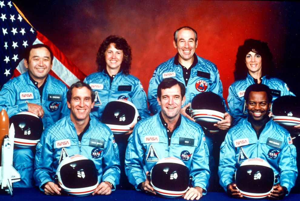
On January 28, 1986, at 11:38 a.m., EST, the space shuttle Challenger lifted off Pad 39B at Kennedy Space Center, Florida. The entire crew of seven was lost in the explosion 73 seconds into the launch. Today, on the 25th anniversary of this national tragedy, we honor in memory the brave crew who gave their lives for the exploration of space. Sharon Christa McAuliffe, a New Hampshire social studies teacher, was NASA’s choice for the first teacher in space. Because McAuliffe was our local astronaut, she is featured heavily in this post, but we honor all seven on the anniversary of a nation’s great loss. -- Paula Nelson (34 photos total)

1. The crew of the space shuttle Challenger. From left: Ellison Onizuka, Mike Smith, Christa McAuliffe, Dick Scobee, Greg Jarvis, Ron McNair and Judith Resnik. (NASA/1986)


Add to Facebook
Add to Twitter
Add to digg
Add to StumbleUpon
Add to Reddit
Add to del.icio.us
Email this Article


"

Consecutive Vowels

Consecutive Vowels: "But the windows! What if there's a voyeur watchi-- wait, now I'm turned on too."

quinta-feira, 27 de janeiro de 2011

Official Android 3.0 Honeycomb Logo Revealed

Official Android 3.0 Honeycomb Logo Revealed: "

So with all of the Honeycomb news announced at CES, and now pouring in with the SDK, one thing was completely looked over. What exactly will be representing Android 3.0 Honeycomb? Well according to some files within the SDK code, we find out that it’s not an actual honeycomb, it’s an Android Bee – Tron style.


Clearly they took some design elements from Tron, but it really does fit well with what we’ve seen with Honeycomb so far. From the ultra-cool clock to the neon accents the Android Honeycomb bee fits in perfectly with the upcoming OS.


One thing that certainly disappoints us is that this bee did not show up on Google’s lawn as did the other representations of previous operating systems. Just think: a blue neon-glowing Android Bee lighting up building 44 – how great that would be.


What do you think of the official logo?


[Via Phandroid]


)"

What you didn't know about Nintendo

What you didn't know about Nintendo: "


Submitted by: guggalight

Posted at: 2011-01-26 07:49:23

See full post and comment: http://9gag.com/gag/72308

"

I phone, you tube.

I phone, you tube.: "


Submitted by: bennybb

Posted at: 2011-01-27 22:28:06

See full post and comment: http://9gag.com/gag/72811

"

terça-feira, 25 de janeiro de 2011

Announcing the 2011 Oscar Nominations: The King's Speech Takes the Lead

Announcing the 2011 Oscar Nominations: The King's Speech Takes the Lead: "

The Oscar nominations are here! This morning, actress Mo'nique joined Academy president Tom Sherak to reveal this year's Oscar nominees in LA. There were a lot of nominees that were expected, but also a few surprises! The King's Speech and The Social Network have been dominating award season, and it's no different for the Academy Awards, but plenty of other films received lots of love this morning, like Winter's Bone, True Grit, and Toy Story 3, which all made it into the 10-film best picture category.


Naturally, not everyone can get a nomination, so there were a few of my favorites shut out (like Ryan Gosling and Andrew Garfield). In any case, you can watch the live announcements right now, and to see the full list, just read more.


BEST PICTURE

The King's Speech

127 Hours

Black Swan

The Social Network

Toy Story 3

True Grit

Winter's Bone

Inception

The Kids Are All Right

The Fighter


BEST DIRECTOR

Darren Aronofsky, Black Swan

David Fincher, The Social Network

Tom Hooper, The King's Speech

David O. Russell, The Fighter

Joel and Ethan Coen, True Grit


BEST SUPPORTING ACTRESS

Amy Adams, The Fighter

Helena Bonham Carter, The King's Speech

Melissa Leo, The Fighter

Hailee Steinfeld, True Grit

Jacki Weaver, Animal Kingdom


BEST SUPPORTING ACTOR

John Hawkes, Winter's Bone

Christian Bale, The Fighter

Jeremy Renner, The Town

Mark Ruffalo, The Kids Are All Right

Geoffrey Rush, The King's Speech


BEST ACTRESS

Natalie Portman, Black Swan

Annette Bening, The Kids Are All Right

Jennifer Lawrence, Winter's Bone

Nicole Kidman, Rabbit Hole

Michelle Williams, Blue Valentine


BEST ACTOR

Javier Bardem, Biutiful

Jeff Bridges, True Grit

Jesse Eisenberg, The Social Network

Colin Firth, The King's Speech

James Franco, 127 Hours


BEST ORIGINAL SCREENPLAY

Another Year, Mike Leigh

The Fighter, Scott Silver, Paul Tamasy, Eric Johnson, and Keith Dorrington

Inception, Christopher Nolan

The Kids Are All Right, Lisa Cholodenko and Stuart Blumberg

The King's Speech, David Seidler


BEST ADAPTED SCREENPLAY

127 Hours, Danny Boyle and Simon Beaufoy

The Social Network, Aaron Sorkin

Toy Story 3, Michael Arndt, John Lasseter, Andrew Stanton, and Lee Unkrich

True Grit, Joel and Ethan Coen

Winter's Bone, Debra Granik and Anne Rossellini


BEST FOREIGN FILM

Biutiful

Dogtooth

In a Better World

Incendies

Outside the Law


BEST ANIMATED FEATURE FILM

How to Train Your Dragon

The Illusionist

Toy Story 3


BEST ACHIEVEMENT IN ART DIRECTION

Alice in Wonderland

Harry Potter and the Deathly Hallows Part 1

Inception

The King's Speech

True Grit


BEST ACHIEVEMENT IN CINEMATOGRAPHY

Black Swan

Inception

The King’s Speech

The Social Network

True Grit


BEST ACHIEVEMENT IN COSTUME DESIGN

Alice in Wonderland

I Am Love

The King's Speech

The Tempest

True Grit


BEST DOCUMENTARY FEATURE

Exit Through the Gift Shop

Gasland

Inside Job

Restrepo

Waste Land


BEST DOCUMENTARY SHORT SUBJECT

Killing in the Name

Poster Girl

Strangers No More

Sun Come Up

The Warriors of Qiugang


BEST ACHIEVEMENT IN FILM EDITING

Andrew Weisblum, Black Swan

Pamela Martin, The Fighter

Tariq Anwar, The King's Speech

Jon Harris, 127 Hours

Angus Wall and Kirk Baxter, The Social Network


ACHIEVEMENT IN MAKEUP

Adrien Morot, Barney's Version

Edouard F. Henriques, Gregory Funk and Yolanda Toussieng, The Way Back

Rick Baker and Dave Elsey, The Wolfman


BEST ORIGINAL SCORE

John Powell, How to Train Your Dragon

Hans Zimmer, Inception

Alexandre Desplat, The King's Speech

A.R. Rahman, 127 Hours

Trent Reznor and Atticus Ross, The Social Network


BEST ORIGINAL SONG

“Coming Home” from Country Strong, Music and Lyric by Tom Douglas, Troy Verges and Hillary Lindsey

“I See the Light” from Tangled, Music by Alan Menken Lyric by Glenn Slater

“If I Rise” from 127 Hours, Music by A.R. Rahman Lyric by Dido and Rollo Armstrong

“We Belong Together” from Toy Story 3, Music and Lyric by Randy Newman


BEST ANIMATED SHORT FILM

Day & Night

The Gruffalo

Let's Pollute

The Lost Thing

Madagascar, carnet de voyage (Madagascar, a Journey Diary)


BEST LIVE ACTION SHORT FILM

The Confession

The Crush

God of Love

Na Wewe

Wish 143


ACHIEVEMENT IN SOUND EDITING

Inception

Toy Story 3

Tron: Legacy

True Grit

Unstoppable


ACHIEVEMENT IN SOUND MIXING

Inception

The King’s Speech

Salt

The Social Network

True Grit


ACHIEVEMENT IN VISUAL EFFECTS

Alice in Wonderland

Harry Potter and the Deathly Hallows Part 1

Hereafter

Inception

Iron Man 2

"

555 Design Contest, Win $1500+ in prizes!

555 Design Contest, Win $1500+ in prizes!: "


Sure, microcontrollers are useful, easy to apply, and ubiquitous, but where is the fun in the easy route? Well, for those of you out there with a little imagination and a 555 timer sitting around, there could be rewards in store. Brought to you by such famous personalities as Jeri Ellsworth and Chris Gammell, the 555 contest has prizes and awards for a number of different categories, such as over the top designs as well as awards for most minimalistic. To top it all off, they are even selling T-shirts to benefit engineering education charities.


The craziest (and possibly coolest) part of the entire contest is that the it has all been put together by the hacking community, with no exclusive sponsorship deals or payment to the organizers being accepted. In the spirit of giving, we will be adding some Hack a Day merch to the swag pile, so keep an eye out for the skull and wrenches. Currently the prize list includes a pair of Beagle Boards, a custom hacked Commodore 64 Joystick from Jeri, as well as a number of other project parts and lots more. The sponsorship list is still growing, so all of our information is tentative (and exclusive!), but be sure to check out the complete list so far after the break.


Here is the tentative list of prizes. Subject to change.


  • Eagle Pro (Layout+Schematic+Autorouter) from Element14 and Cadsoft

  • Free shipping on 555’s with no minimum from Element14

  • Hacked C64 Joystick from me

  • 20sq in of PCB from @laen and DorkbotsPDX PCB pool

  • OLED displays from Savage Circuits

  • Maker T-Shirts from MakerTees.com

  • 2 Beagle Boards

  • Hackaday stickers and shirts

  • Altium FPGA Nanoboard

  • Extech’s “five for five” free pen meters to random contestants

  • Extech’s Multiscope

  • SumoBot Competition Kit from Parallax Inc and Digikey

  • Oomlout Arduino Kit


Special prizes:


  • 40 Text LCD Modules from EEvblog for the best Aussie project

  • To be determined prize for the best under 18yrs old entry. This will include adult/child entries.


Filed under: contests

"

The History of Social Media [INFOGRAPHIC]

The History of Social Media [INFOGRAPHIC]: "


From the first e-mail to the domination of Facebook, social media has come a long way, baby.


Here’s a visually organized look at the past 30 years or so of social media history, from Usenet to AIM to Friendster and beyond. This particular infographic comes with some fun facts; for example, did you know that the first version of MySpace was coded in just 10 days?


Whether this is a walk down memory lane or entirely new information for you, we hope you’ll enjoy this infographic, which was created by OnlineSchools.org. You can also check out our infographics on Facebook facts, online dating and our general obsession with social media.


In the comments, tell us where you set up your first “social” online account and where or when you think social media truly began.


Lead image courtesy of Flickr, rishibando.


More About: infographic, social media, trending

For more Social Media coverage:

"

Minha lista de blogs