sábado, 6 de agosto de 2011
quinta-feira, 4 de agosto de 2011
Connecting Web Apps with Web Intents
Android OS addresses this problem with Intents, a facility for late run-time binding between components in the same or different applications. In the Intents system, the client application requests a generic action, e.g. share, and specifies the data to pass to the selected service application. The user is given a list of applications which have registered that they can handle the requested intent. The user-selected application is created in a new context and passed the data sent from the client, the format of which is predefined for each specific intent type.
We are hard at work designing an analogous system for the web: Web Intents. This web platform API will provide the same benefits of Android Intents, but better suited for web applications. When designing the system, we have first and foremost been interested in creating a simple, easy-to-use API. With Web Intents, you will be able to connect your web app to a service with as little as two lines of code! Chrome will perform the heavy lifting for you. As with Android, Web Intents documents an initial set of intent actions (edit, view, share, etc.) that likely cover the majority of use cases on the web today; however, as the web grows and sites provide more functionality, new intent actions will be added by services that document these intents, some more popular than others. To foster development and use of intents, we plan to create a site to browse existing intents and add new intents.
Consider an online photo storage site run by a cash-strapped startup: the developers don’t have the resources to add image editing abilities to their app, but they feel the site won’t be a hit without it. The Web Intent system will make it easy for them to offer this with little effort.
var intent = new Intent(Intent.EDIT, ‘image/png’, getImageDataURI());
window.navigator.startActivity(intent, loadEditedImage);
// This callback will be called when the service replies with the edited
// image data.
function loadEditedImage(data) {
var image = document.getElementById(‘image’);
setImageData(image, data);
}
When the user visits her favorite memegen service, the site will request registration to handle the EDIT intent for files of type ‘image/*’ using the following declaration:
<intent
action=”http://webintents.org/edit”
type=”image/*”
/>
When the user initiates the EDIT action, this service is presented to the user, along with other registered image editors. Once the user selects Meme Generator, the referenced site is opened in a new context and is able to load the image data from the intent payload:
var intent = window.intent;
memeImg.src = intent.data;
memegenForm.onsubmit = function() {
// Transform the image - meme it.
addMemeTaglines(memeImg, memeTopText, memeBottomText);
// Send the generated meme back to the client.
intent.postResult(getImageData(memeImg));
};
Once postResult() is called, the Meme Generator context is closed and the output data is sent back to the client via the callback passed to startActivity().
Mozilla is also actively exploring this problem space. In fact we’re working closely with Mozilla engineers to unify our two proposals into one simple, useful API. Visit the examples page to try out the feature in any current browser. To explore using the API in your site, check out out the JavaScript shim, which provides an implementation of the API for browsers that have not implemented this feature. We are rapidly prototyping this feature, so check back soon for an announcement when Web Intents is available behind a flag in Chrome.
Posted by James Hawkins, Software Engineer
Big Mac Index
The Economist updates their Big Mac Index, which as we all know, is the most accurate way to measure the global economy:
It is based on the theory of purchasing-power parity (PPP), the notion that in the long run exchange rates should move towards the rate that would equalise the prices of a basket of goods and services around the world. At market exchange rates, a burger is 44% cheaper in China than in America. In other words, the raw Big Mac index suggests that the yuan is 44% undervalued against the dollar. But we have long warned that cheap burgers in China do not prove that the yuan is massively undervalued. Average prices should be lower in poor countries than in rich ones because labour costs are lower. The chart above shows a strong positive relationship between the dollar price of a Big Mac and GDP per person.
When adjusted for GDP, we can see where Big Macs are actually expensive: Brazil, Argentina, and Sweden. I guess there's a premium on special sauce over there.
[The Economist via kottke]
segunda-feira, 1 de agosto de 2011
Dark Knight Rises Poster in Photoshop
A couple of weeks ago I saw the new Dark Knight Rises poster and I love it. The concept was beautiful, using negative spaces to show the Batman symbol. As usual I started to think about ways to do that in Photoshop, then last Saturday I started looking for assets and trying to put together the first concept. After a couple of hours searching for images I found good ones and had a nice start.
Today, Sunday, I woke up 6:30 in order to finish this piece and of course share with you my process. As you will see in this tutorial, the technique behind is pretty simple and straightforward. I didn't want to create exactly the same because I know it's impossible due the assets and I believe the original one was done using 3D.
So in this tutorial I will show you how to create the Dark Knight Rises poster in Photoshop. Be ready, it might take you a few hours, but the result is really nice and you will be able to apply this technique in other future projects, I am really sure of that.
Step 1
Open Photoshop and create a new document. I am using a portrait mode for the poster, the size is 2550x3500 pixels. After that fill the background layer with grey (#b0adad).
Step 2
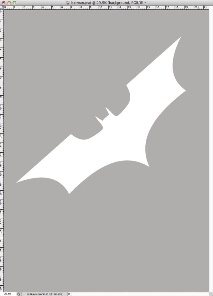
The next step is find the Batman logo. Search it on Google, it's pretty easy to find. Once you have the logo, place it in your canvas like the image below. The color doesn't really matter, we will use for masking reference.
Step 3
As I said in the beginning this tutorial is a big photo collage, in which the most important thing is finding the right assets. In this part we have to place some buildings. I found quite useful images on Shutterstock and you can check them out here:
http://www.shutterstock.com/pic-20863036/stock-photo-modern-buildings-in...
http://www.shutterstock.com/pic-346534/stock-photo-three-corporate-build...
http://www.shutterstock.com/pic-2286315/stock-photo-corporate-buildings-...
http://www.shutterstock.com/pic-80798674/stock-photo-corporate-buildings...
Step 4
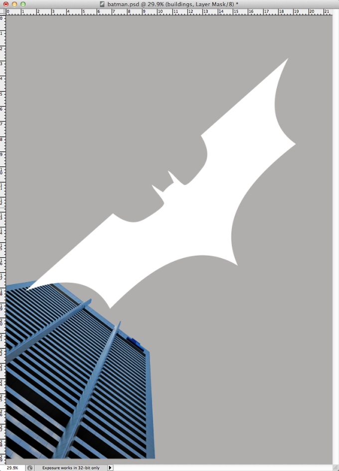
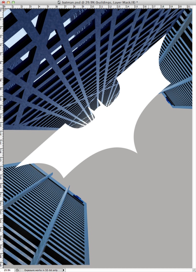
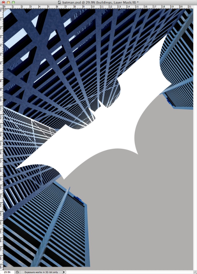
Start placing the buildings using the batman logo for reference of position and size.
Step 5
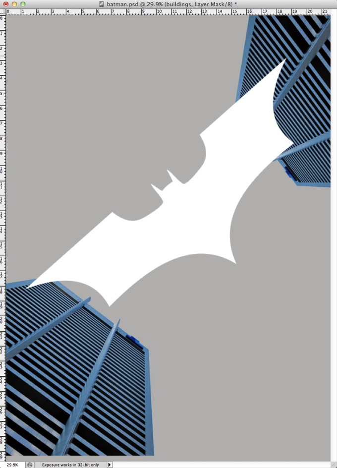
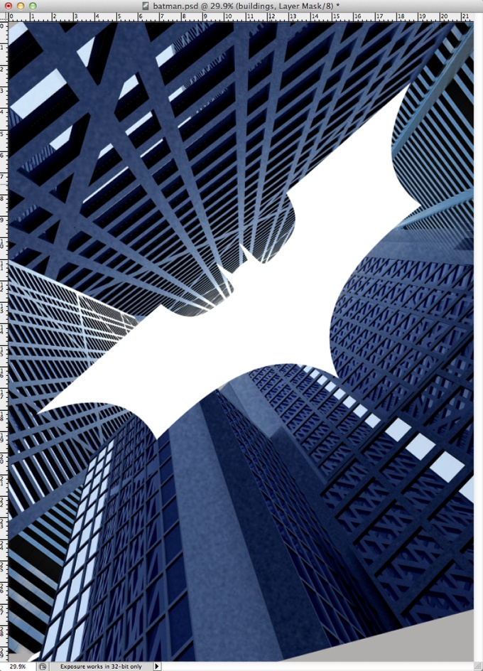
Here we have covered all canvas and the logo is our negative space.
Step 6
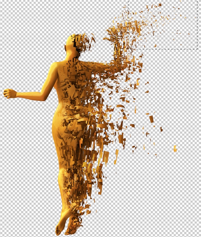
In order to create all the shatters and destruction in the original poster I used some other images from Shutterstock that I had downloaded while back. It's good to have these assets because you can always reuse them later. This one can be found at http://www.shutterstock.com/pic-73243228/stock-photo-abstract-character-...
Step 7
Just copy some shatters from the image and start placing in your scene. You can resize and rotate them, or even create a brush. I was lazy so I was copying and pasting them.
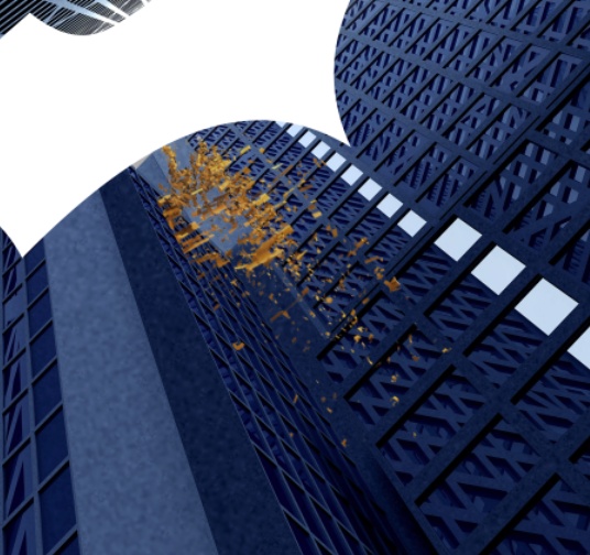
Step 8
In order to make the effect more realistic it's necessary to add some motion blur to these shatters. So for every block go to Filter>Blur>Motion Blur. Use the building perspective for Angle reference.
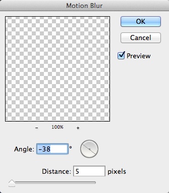
Step 9
Here you have the scene with the shatters.
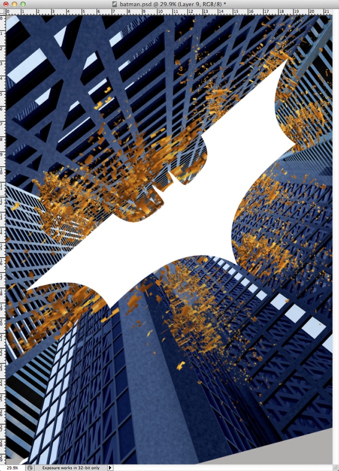
Step 10
Everything was too clean an perfect in terms of textures and colors. So in order to solve that I placed a big concrete texture on top of the other layers with Multiply for th Blend Mode. Don't worry about colors yet, we will get there in a few.
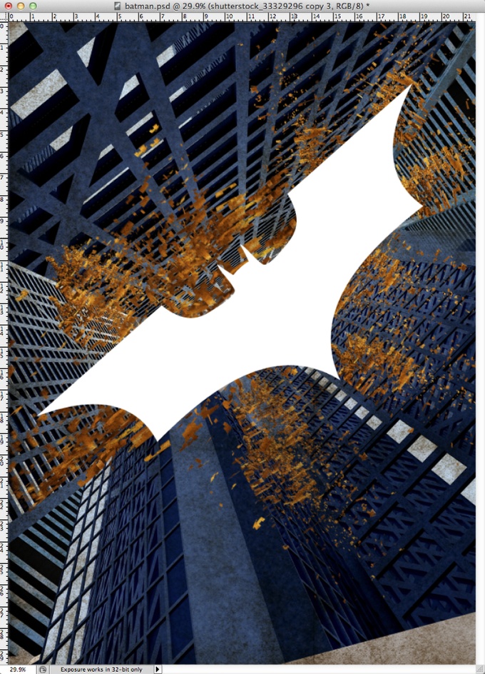
Step 11
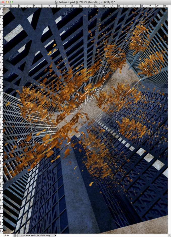
Select all layers but the background and go to Layer>Group Layers. After that with the Magic Wand Tool (W) select the batman symbol. You can hide the batman symbol layer right after that.
Step 12
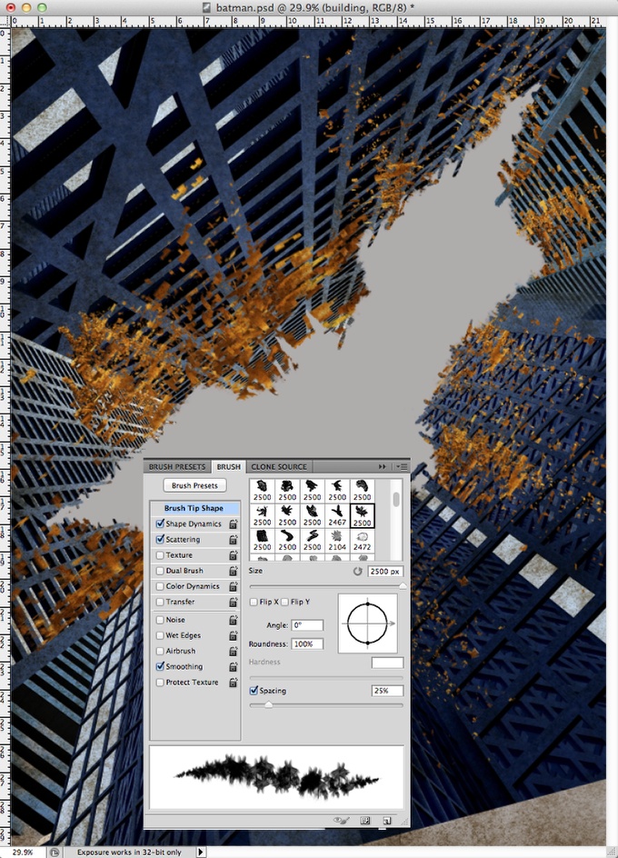
With the group selected go to Layer>Layer Mask>Hide Selection Now the buildiing and the shatters will be hidden on the area that th batman symbol was. It looks good but it's too perfect. So in order to solve that let's use the Brush Tool (B) and create a brush using a grunge brush. Just Google for grunge brushes in Photoshop. Tip: Reduce the spacing, use Shape Dynamics and Scattering in order to make a brush that is perfect for destruction effects.
After that start painting in the mask with black and the new brush. The idea here is destroy the edges of the batman symbol to make it very subtle.
Step 13
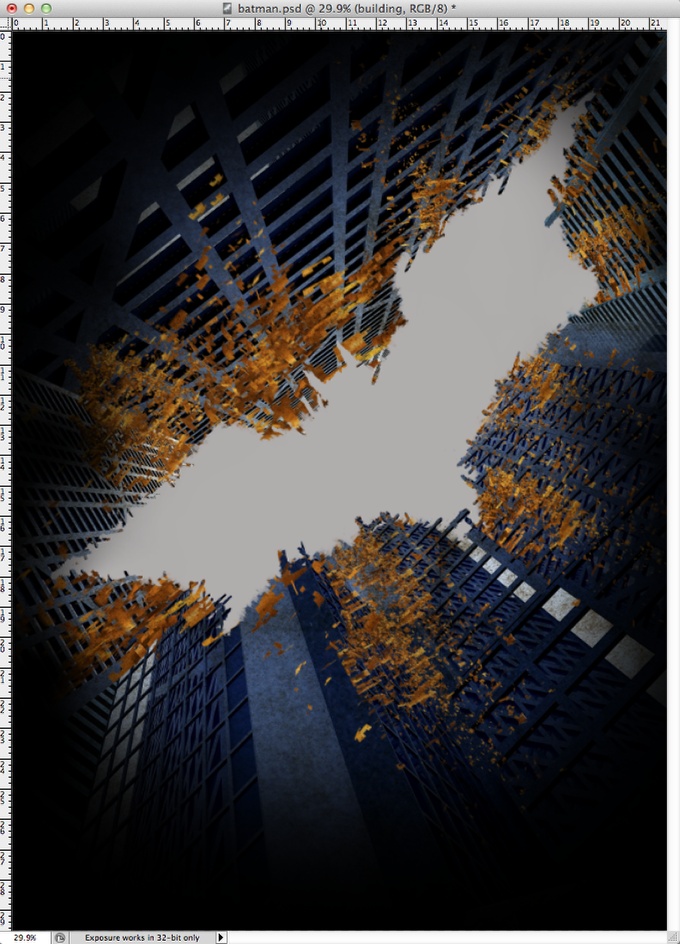
Add a layer on top of the others and then with the Brush Tool (B) and a very soft brush, start painting the edges of the canvas with black to create a vignette effect.
Step 14
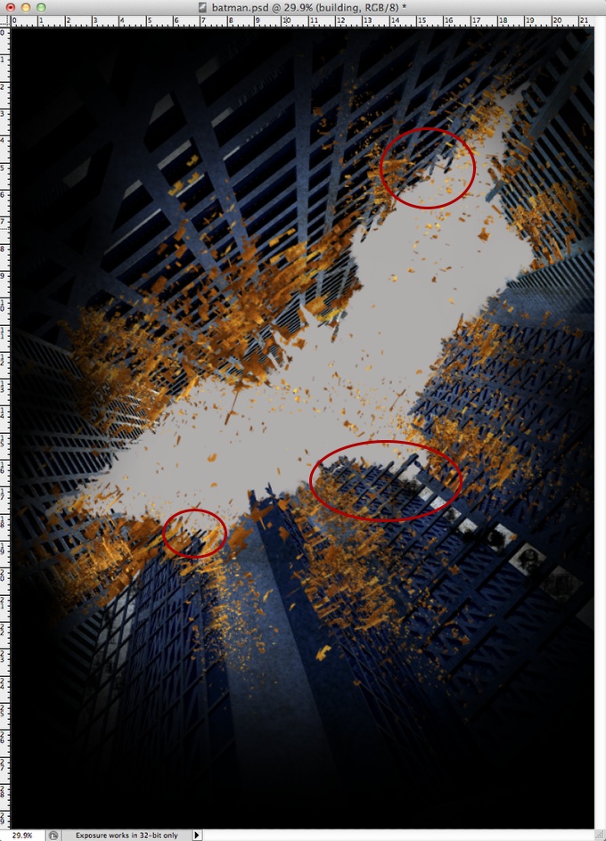
The image still was too clean in my opinion, so I added a few more shatters and also paint some of the white windows with black using a grunge brush. The idea is make the image really destroyed. Another detail is when you are make the edges of the batman symbol less uniform, try to make it was the buildings were really falling a part. So keep some windows and structure of the building visible. Use the image below for reference.
Step 15
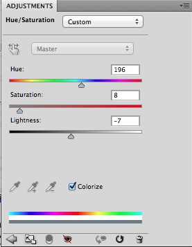
Time to fix the color problem. There are many ways to do that, but my idea is find a quick fix. So go to Layer>New Adjustment Layer>Hue and Saturation. Change the Hue to 195, the Saturation to 8 and the Lightness to -7.
Step 16
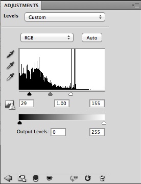
Now go to Layer>New Adjustment Layer>Levels. Use 29 for the black input, 1.00 for the grey and 155 for the white input. Tip: both adjustment layers have to be on top of the other layers.
Step 17
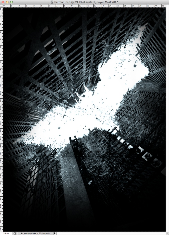
Here is the image after the adjustment layers. It looks really nice aready.
Step 18
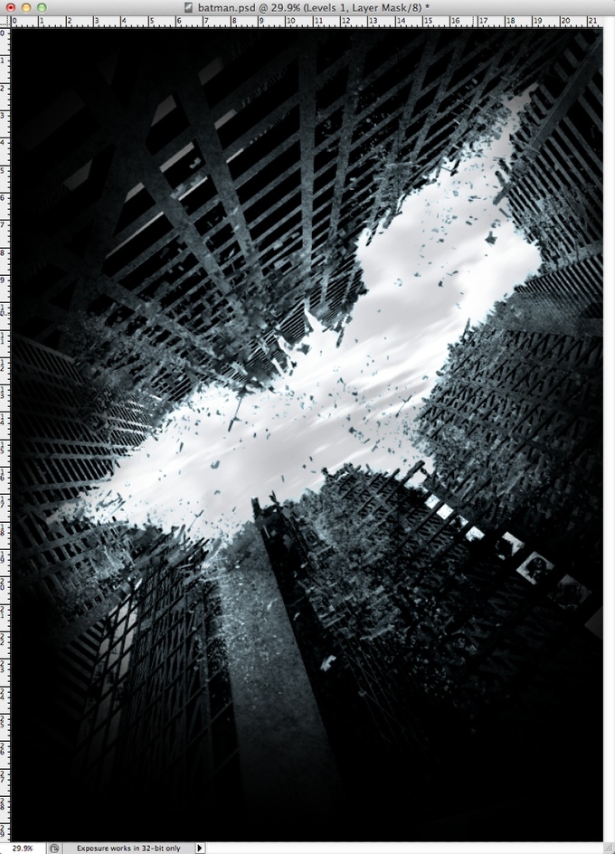
Here lets add some clouds in the sky. Just use any clouds image you find, desaturate it and place it using multiply for the Blend Mode. If you place it on top of the other layers, use the same mask you are using for the buildings to show only the batman symbol area.
Step 19
Add a new layer behind the buildings layer and the with the Brush Tool (B) and a very small brush with black, start painting some sort of lines on top of the building like in the destructed areas.
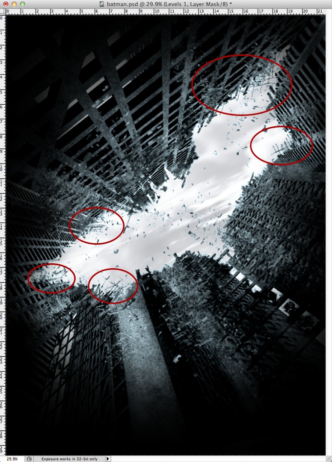
Step 20
The original poster had some rocks falling from the sky. So let's add some rocks too. I used another image from Shutterstock for reference, you can find it here http://www.shutterstock.com/pic-24964786/stock-photo-zoom-of-gravel-gray.... I just selected one rock copied and pasted it in my design.

Step 21
Paste the rock in your design and select it. After that go to Edit>Define Brush. You will create a brush with the shape of the rock. Edit the brush and for the Shape Dynamics make sure you have Flip X and Y selected, also Size Jitter. Select Scatter too in order to make the brush very random.
Once you have the brush done, start painting some rocks falling from the sky. Follow the perspective and make the ones on top smaller than the ones close to the bottom of the page. You can see I used white for the color, don't worry about that, we will fix this issue with Layer Styles.
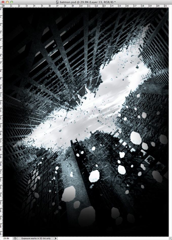
Step 22
Go to Layer>Layer Style>Pattern Overlay. Select Multiply for the Blend Mode and for the Pattern select Black Marble (it's a default one).
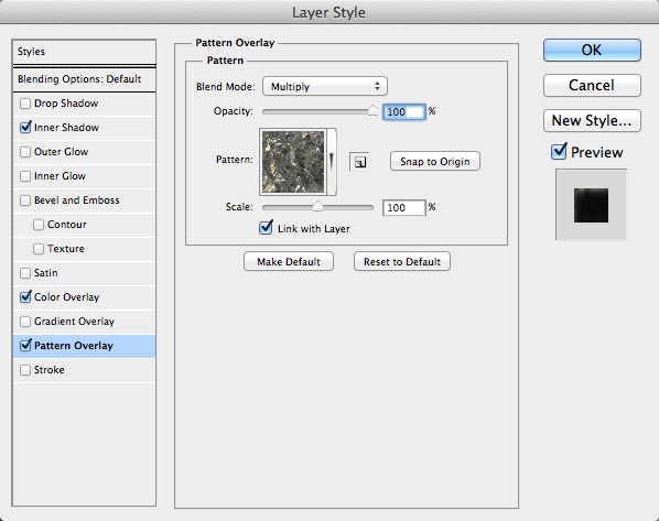
Step 23
Select Color Overlay. For the Blend Mode use Multiply and for the color use a dark grey.
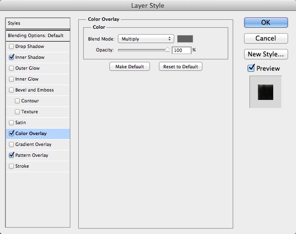
Step 24
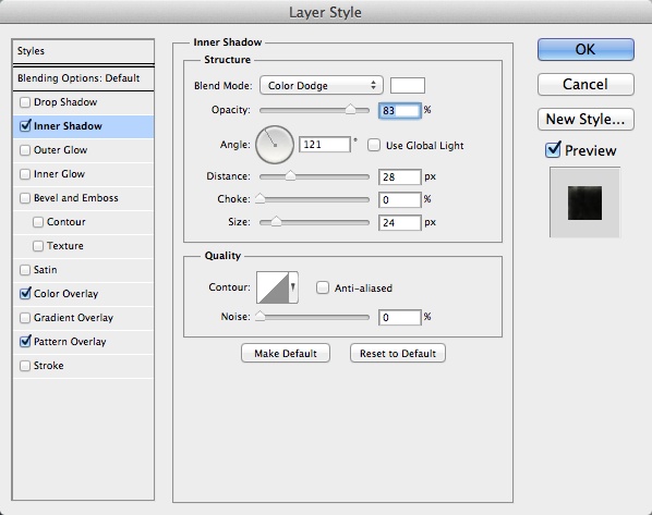
Now select Inner Shadow. For the color use White; for the Blend Mode use Color Dodge; for the Angle, this is really important, depending where the rocks are, use an angle that follows the perspective of the building they are in front of. In this case 121º. For the Distance use 28 pixels, for the Choke 0 and for the Size 25 pixels.
Step 25
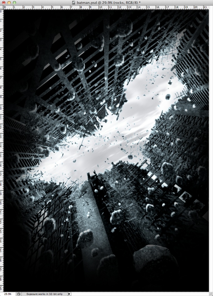
Here are the rocks with the layer styles. Notice that the adjustment layers are on top of the rocks layer as well. Another important thing here is to apply motion blur (Filter>Blur>Motion Blur) to the rocks as we did for the other layers in the steps 7-9.

Step 26
Add more rocks in your design. Remember the inner shadow angle will vary according to the location of the rocks.
Step 27
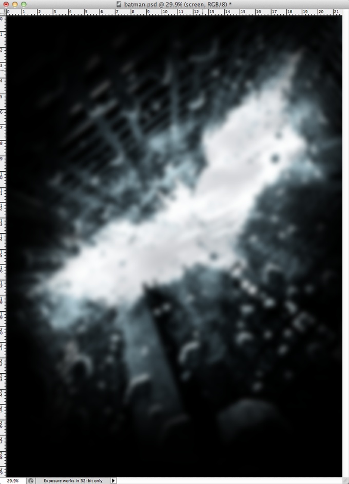
Select all layers and duplicate them, after that merge all the duplicated layers into one. The shortcut for that is Command(mac)/Control(pc) + Alt + Shift + E. Change the Blend Mode to Soft Light at 50% Opacity. Duplicate this new layer and change the Blend Mode to Screen at 100% Opacity. Go to Filter>Blur>Gaussian Blur. Use 20 pixels for the Radius.
Conclusion
Delete pretty much the whole layer with the screen mode, leave just a few areas around the batman symbol to create a sort of glowing effect. The design is practically done.
As you could see, most of the process was messing with layers and adding some blurs. The most difficult part is finding the right assets, once you find them it's putting everything together and adjust them to make the image look real. It's a really nice technique and I love this posters and recreate them to learn new things and practice Photoshop more. Now it's up to you. Have fun.

Download the Photoshop File
Click here to download the Photoshop file used for this tutorial
About the author
Abduzeedo is a blog about design. There are all sorts of articles for those who want to look for inspiration. Also you will find very useful tutorials for the most used applications out there, with a special selection of Photoshop Tutorials and Illustrator Tutorials. You can get in follow us via Twitter at @abduzeedo
Sponsored Links:

domingo, 31 de julho de 2011
Reddit explains the debt ceiling to you like you’re five
Yesterday and today on Reddit, the subreddit section explain like I’m five, where users explain current news and tough topics as though they’re talking to a five-year-old, saw a huge surge in posts and interaction. One of the gems from this influx of interest is a post on what’s going on with the US government’s debates over the debt ceiling. Redditor The_Cleric lays it out for my five-year-old self:
This is how I understand it.
Pretend you have a credit card. And this credit card has a limit, we’ll say $1000. This credit card is pretty near maxed out and you don’t really have any cash. You need to buy some stuff soon, and you know that between now and August 2nd you need to buy some things, and you have no choice but to buy them on the credit card. At that point the credit card will be completely maxed out.
This credit card is our debt ceiling. We will hit the limit of our borrowing limit on August 2nd.
Now let’s continue further. We know we have some bills next month, and we also know that we have some cash coming in, but when we look at what we have coming in vs what we have to pay, we don’t have enough to cover it. Let’s just say we know we’ll be short by $100. So now we know ahead of time that we’ll be short, and we only have one real option: call the credit card company and ask them to raise our limit.This is what the debt ceiling legislation is trying to do: raise our credit limit.
As you said, normally this happens all the time without issue. This time, some politicians decided to stand up and say: “Umm, long term this whole ‘borrow more money’ method may not work out.” So they are holding off on raising the debt ceiling until we can better align our “bills” and our “income”. There’s two ways to do this: either you lower your bills or you raise your income. Either you pay less money out, or you bring more money in.This is where the argument happens. Democrats (traditionally) would prefer to bring more money in, so they’d like to “raise taxes”. Republicans (traditionally) would prefer to have lower bills, so they’d like to do “spending cuts”.
So the argument now is “How can we find a compromise where everyone is happy?” We haven’t (yet, hopefully) found that compromise.
If we don’t find the compromise, and we don’t raise the debt ceiling, then we’ll have a bunch of bills due and not enough money to pay them. At this point we’ll have to start prioritizing who gets the money we do have. Should it be seniors on Medicare? Should it be active duty military? Should it be people we owe interest to for a loan payment?
This is just like our credit card example if the credit card company doesn’t raise our limit. Do we pay our rent? Do we pay our car payment? Do we pay back a guy we borrowed $50 from?
And the repercussions are this: whoever we DON’T pay, how does that negatively affect us? Will we be able to get more loans? Will people lose trust in us and a government? Etc. So the outcomes could be nothing or they could be disastrous. No one knows for sure.
Pretty solid. There’s lots more discussion on the topic in the thread, and a promising link to Khan Academy’s take on the subject.
via Can someone describe the debt ceiling to me Like Im Five? : explainlikeimfive.
Minha lista de blogs
-
Mistakes Traders Make - *4/26/2026* - What makes our trading psychology is not whether we make mistakes, but what we do with those mistakes. In the coming series of posts, we...Há 14 horas
-
RTO Gets Serious: October 1 - If ever a week was ripe for delaying your return to the office, it was this one. Hurricane Idalia cleared out the weather up and down the coast, brin...Há 2 anos
-
Hello world! - Welcome to WordPress. This is your first post. Edit or delete it, then start writing!Há 4 anos
-
Blog Post Title - What goes into a blog post? Helpful, industry-specific content that: 1) gives readers a useful takeaway, and 2) shows you’re an industry expert. Use your...Há 4 anos
-
Top 25+ Custom Software Development Companies 2017 - This article is published in collaboration with Scutify, where you can find real-time markets aHá 8 anos
-
-
Bank of England Speeds Through Bond Buys - Two weeks after buying its first corporate bond, the Bank of England has already spent over 10% of the funds allocated to its 18 month asset-buying program.Há 9 anos
-
-
Tech's Most Useless Big Shot - Creative Artists Agency is reportedly discussing opening a Silicon Valley office where tech executives would become "rock stars." And they may start with...Há 14 anos
-
Low Volume Melt Up - *FN:* On the way down there is volume. On the way up, there is less... waaaay less (especially for this time of the year). Can you say algos? So what does...Há 16 anos
-
-
-
YouTube is prompting users to enable watch history. Heres the workaround. - YouTube users with their watch history paused have found that the site will not populate the homepage unless they turn it back onHá 9 horas
-
The Weekly Trade Plan: Top Stock Ideas & Execution Strategy – Week of April 27 2026 - Traders, I look forward to sharing some of my top ideas with you all for the upcoming week. So, without any delay, let’s get right into it: Starting with...Há 12 horas
-
The Catalyst Is Coming for United Parcel Service. Here's Why Smart Investors Are Buying Before July. - United Parcel Service is about to hit an inflection point, which will become even more clear after second quarter earnings.Há 13 horas
-
Hauntingly Blurred Portraits - Artists Shinseungback Kimyonghun has Created Movie-Themed Photos (TrendHunter.com) - (TrendHunter.com) It is difficult to dehumanize humans, but the artistic group of Shinseungback Kimyonghun has created terrifying portraits of people from...Há 12 anos
-
Tech's Most Useless Big Shot - Creative Artists Agency is reportedly discussing opening a Silicon Valley office where tech executives would become "rock stars." And they may start with...Há 14 anos


