At first glance, you might wonder why the new GridLayout class even exists in Android 4.0 (aka Ice Cream Sandwich). It sounds a lot like TableLayout. In fact, it’s a very useful new layout control. We’ll create a simple numeric keypad using GridLayout to demonstrate a small taste of its power and elegance.
GridLayout (android.widget.GridLayout) initially seems like it’s a way to create tables much like TableLayout (android.widget.TableLayout). However, it’s much more flexible than the TableLayout control. For instance, cells can span rows, unlike with TableLayout. Its flexibility, however, comes from the fact that it really helps to line up objects along the virtual grid lines created while building a view with GridLayout.
Step 0: Getting Started
We provide the full source code for the sample application discussed in this tutorial. You can download the sample source code we provide for review.
Step 1: Planning for the Keypad
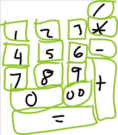
The following shows a rough sketch of the keypad we will build.

Some things of note for the layout:
- 5 rows, 4 columns
- Both column span and row span are used
- Not all cells are populated
When designing a layout like this before GridLayout existed, we’d know that TableLayout use wouldn’t be feasible because of the row span. We’d likely resort to using a nested combination of LinearLayout controls—not the most efficient design. But in Android 4.0, there’s a more efficient control that suits our purposes: GridLayout.
Step 2: Identifying a Grid Strategy
GridLayout controls, like LinearLayout controls, can have horizontal and vertical orientations. That is, setting a vertical orientation means the next cell will be down a row from the current one and possibly moving right to the next column. Horizontal orientation means the next cell is to the right, and also possibly wrapping around to the next row, starting on the left.
For this keypad, if we start on the forward slash cell (/), and use horizontal orientation, no cells need be skipped. Choosing horizontal means we have to limit the number of columns to get the automatic wrapping to the next row at the correct location. In this example, there are 4 columns.
Finally, we want the View control in each cell (in this case, these are Button controls) to be centered and we want the whole layout to size itself to the content.
The following XML defines the GridLayout container we’ll need:
<GridLayout xmlns:android="http://schemas.android.com/apk/res/android"
    android:layout_width="wrap_content"
    android:layout_height="wrap_content"
    android:layout_gravity="center"
    android:columnCount="4"
    android:orientation="horizontal" >
</GridLayout>
Step 3: Defining the Simple Cells
The child controls of the GridLayout control are defined a little differently than you might be used to. Instead of explicitly declaring a size (width & height) to a control with wrap_content or match_parent, the default is wrap_content for all children, and match_parent behaves the same as wrap_content as the sizing is controlled by different rules (which you can read all about in the GridLayout docs for creating more complex grid-aligned layouts).
Each cell will contain a single Button control with a text label. Therefore, each of the simple cells is merely defined as follows:
<Button android:text="1" />
<Button android:text="2" />
<!-- and so on... -->
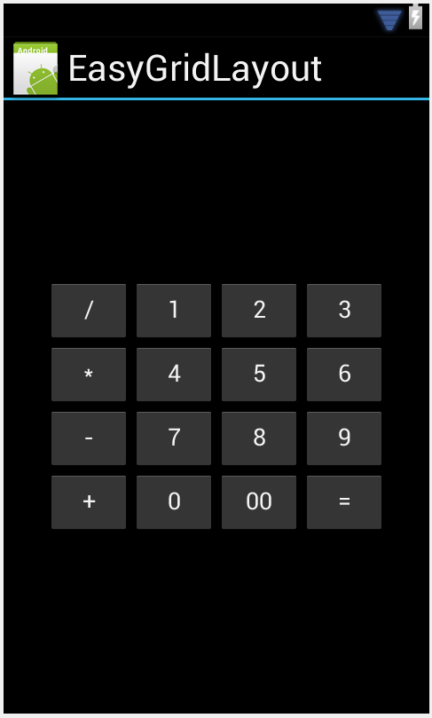
If you just left that as-is, you’d end up with a layout looking like this:

Clearly, there’s more we can do here.
Step 4: Defining the Rest of the Cells
The current layout isn’t exactly what we want. The /, +, 0, and = Button controls are all special when it comes to laying them out properly. Let’s look at them:
- The / (division sign or forward slash) Button control retains its current size, but it should start in the 4th column.
- The + (plus sign) Button control first appears in the horizontal orientation direction directly after the 9 button, but it should span three rows.
- The 0 (zero) Button control should span two columns.
- The = (equal sign) button should span three columns.
Applying these subtle changes to the GridLayout results in the following XML definition:
<?xml version="1.0" encoding="utf-8"?>
<GridLayout xmlns:android="http://schemas.android.com/apk/res/android"
    android:layout_width="wrap_content"
    android:layout_height="wrap_content"
    android:layout_gravity="center"
    android:columnCount="4"
    android:orientation="horizontal" >

    <Button
        android:layout_column="3"
        android:text="/" />

    <Button android:text="1" />

<!-- Other numbers -->

    <Button android:text="9" />

    <Button
        android:layout_rowSpan="3"
        android:text="+" />

    <Button
        android:layout_columnSpan="2"
        android:text="0" />

    <Button android:text="00" />

    <Button
        android:layout_columnSpan="3"
        android:text="=" />

</GridLayout>
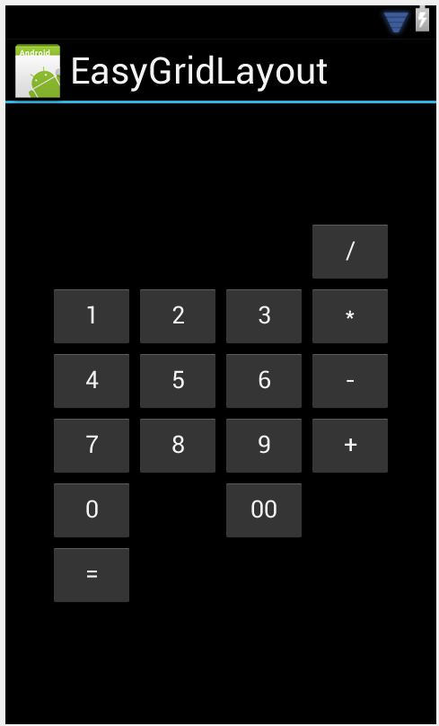
Are we there yet? You decide:

We’re getting there, but it’s not quite what we want yet, is it? The spanning is in place, but the cell content sizing isn’t quite right now.
Step 5: Filling in the Holes
The width and height values of the Button controls are not yet correct. You might immediately think that the solution is to adjust the layout_width and layout_height. But remember, the values for automatic scaling, just as wrap_content and match_parent, both behave the same and are already applied.
The solution is simple. In a GridLayout container, the layout_gravity attribute adjusts how each view control should be placed in the cell. Besides just controlling drawing centered or at the top, and other positioning values, the layout_gravity attribute can also adjust the size. Simply set layout_gravity to fill so each special case view control expands to the size of the container it’s in. In the case of GridLayout, the container is the cell.
Here’s our final layout XML:
<?xml version="1.0" encoding="utf-8"?>
<GridLayout xmlns:android="http://schemas.android.com/apk/res/android"
    android:layout_width="wrap_content"
    android:layout_height="wrap_content"
    android:layout_gravity="center"
    android:columnCount="4"
    android:orientation="horizontal" >

    <Button
        android:layout_column="3"
        android:text="/" />

    <Button android:text="1" />

    <Button android:text="2" />

    <Button android:text="3" />

    <Button android:text="*" />

    <Button android:text="4" />

    <Button android:text="5" />

    <Button android:text="6" />

    <Button android:text="-" />

    <Button android:text="7" />

    <Button android:text="8" />

    <Button android:text="9" />

    <Button
        android:layout_gravity="fill"
        android:layout_rowSpan="3"
        android:text="+" />

    <Button
        android:layout_columnSpan="2"
        android:layout_gravity="fill"
        android:text="0" />

    <Button android:text="00" />

    <Button
        android:layout_columnSpan="3"
        android:layout_gravity="fill"
        android:text="=" />

</GridLayout>
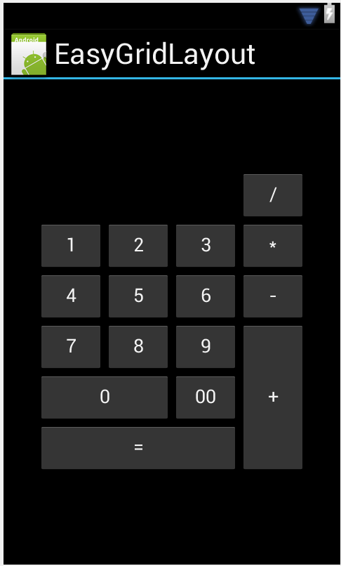
And here’s the final result:

Finally, that’s exactly what we’re looking for!
Conclusion
While GridLayout isn’t just for use with items that line up in a regular sized table-like layout, it may be easier to use than TableLayout for such designs. Here you saw how it can provide a lot of flexibility and functionality with minimal configuration. However, any layout that can be defined in terms of grid lines — not just cells — can likely be done with less effort and better performance in a GridLayout than other container types. The new GridLayout control for Android 4.0 is very powerful and we’ve just scratched the surface of what it can do.
About the Authors
Mobile developers Lauren Darcey and Shane Conder have coauthored several books on Android development: an in-depth programming book entitled Android Wireless Application Development, Second Edition and Sams Teach Yourself Android Application Development in 24 Hours, Second Edition. When not writing, they spend their time developing mobile software at their company and providing consulting services. They can be reached at via email to androidwirelessdev+mt@gmail.com, via their blog at androidbook.blogspot.com, and on Twitter @androidwireless.


Nenhum comentário:
Postar um comentário